ux / ui / design thinking
Elevating the experience of browsing real estate properties
Elevating the experience of browsing real estate properties
I helped users confidently search for homes by improving the real estate portal’s structure, usability, and content clarity.
Project overview
The project was carried out over the span of two months, in a project team compromised of myself and two developers.
My contributions
My responsibilities in the project were to research user needs, carry out a Design Thinking process and create a UI design for the new procuct.
Contents
Starting point: a need for redesign
A real estate portal’s main functionality is to allow users to browse available properties with ease. Every person has vastly different needs when choosing their next property to buy or rent, so the information that they input has to be very specific in order for them to succeed in their search.
The main problem with varianti.lv was that the search criteria were limited and it was not possible to get specific search results.
Empathising with users
The project was developed with Design Thinking, and the first thing I needed to do was to carry out research about users.
In order to find valuable insights into user’s preferences, I conducted qualitative interviews. My questions were mainly about their motivation for choosing online portals for property purchase and rental, and about their preferred search criteria.
I compiled the findings of the interviews into empathy maps so that I could identify users’ thoughts, feelings, and actions. This helped me to understand and empathize with their struggles related to finding a new home.

Define & ideate
Following the empathy phase, I analyzed the users’ thoughts, behaviors, needs, and pain points captured in the empathy map. Several recurring challenges emerged:
- Users feel pressured to find housing quickly, often within tight deadlines.
- They experience frustration with disorganized listings and insufficient search filters.
- There’s skepticism toward current platforms due to privacy concerns and poor usability.
Since I was following the Design Thinking process, the next action was to translate the observations from research into clear problem statements. To open up actionable design opportunities, I reformulated each into “How might we…” questions to reframe problems as possibilities:
How might we...
- ensure that users have the means to carry out the renting out/buying process independently?
- present listing details in a clear and structured way?
- provide sufficient metadata to support meaningful and efficient searches?
These questions laid the groundwork for the Ideate phase of the Design Thinking process. Through several brainstorming sessions, I generated a wide range of potential solutions to address the identified user challenges.
Once I had gathered enough ideas, I mapped them on an Effort vs. Impact Matrix — a tool that helped evaluate and compare each solution based on the value it could deliver to users versus the effort required to implement it.

Ideas with low user value or high implementation complexity were filtered out, allowing the most promising features to stand out. The concepts marked in darker colors on the matrix are those I chose to move forward with, as they offer a high-impact solution to real user problems while remaining feasible to implement within scope.
Information architecture & metadata
I started off the Prototype phase of Design Thinking by determining the new product’s information architecture based on data I gathered from field research and benchmarking other real estate portals.
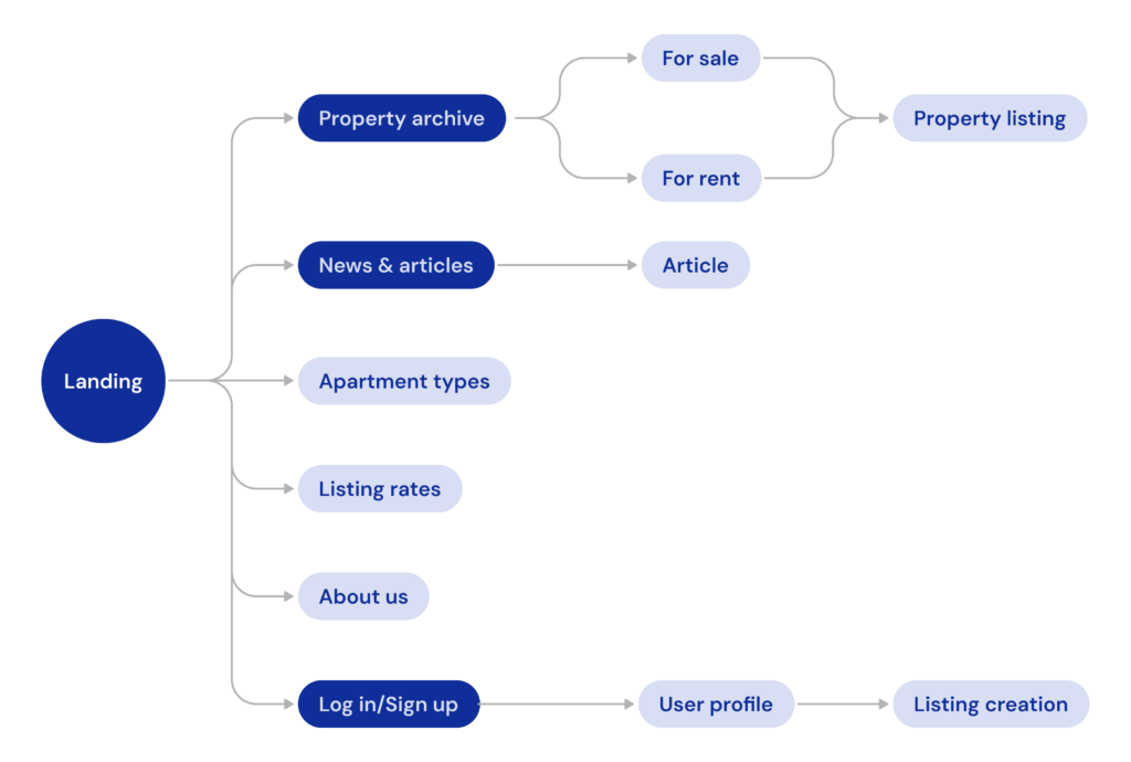
I focused on improving the filtering functions and the organization of the property listings’ metadata on the portal. In order to have a clear and efficient classification scheme for properties, I organized a system of well-defined taxonomies and metadata.
Prototyping and creating wireframes
Most of the planning regarding information architecture and the organization of content was done during the wireframing. I find it to be an efficient way to structure content and see how the content blocks make up the visual layout of the page.
I annotated some of the wireframes with arguments for my design choices so that project stakeholders could see the reason behind the decisions.

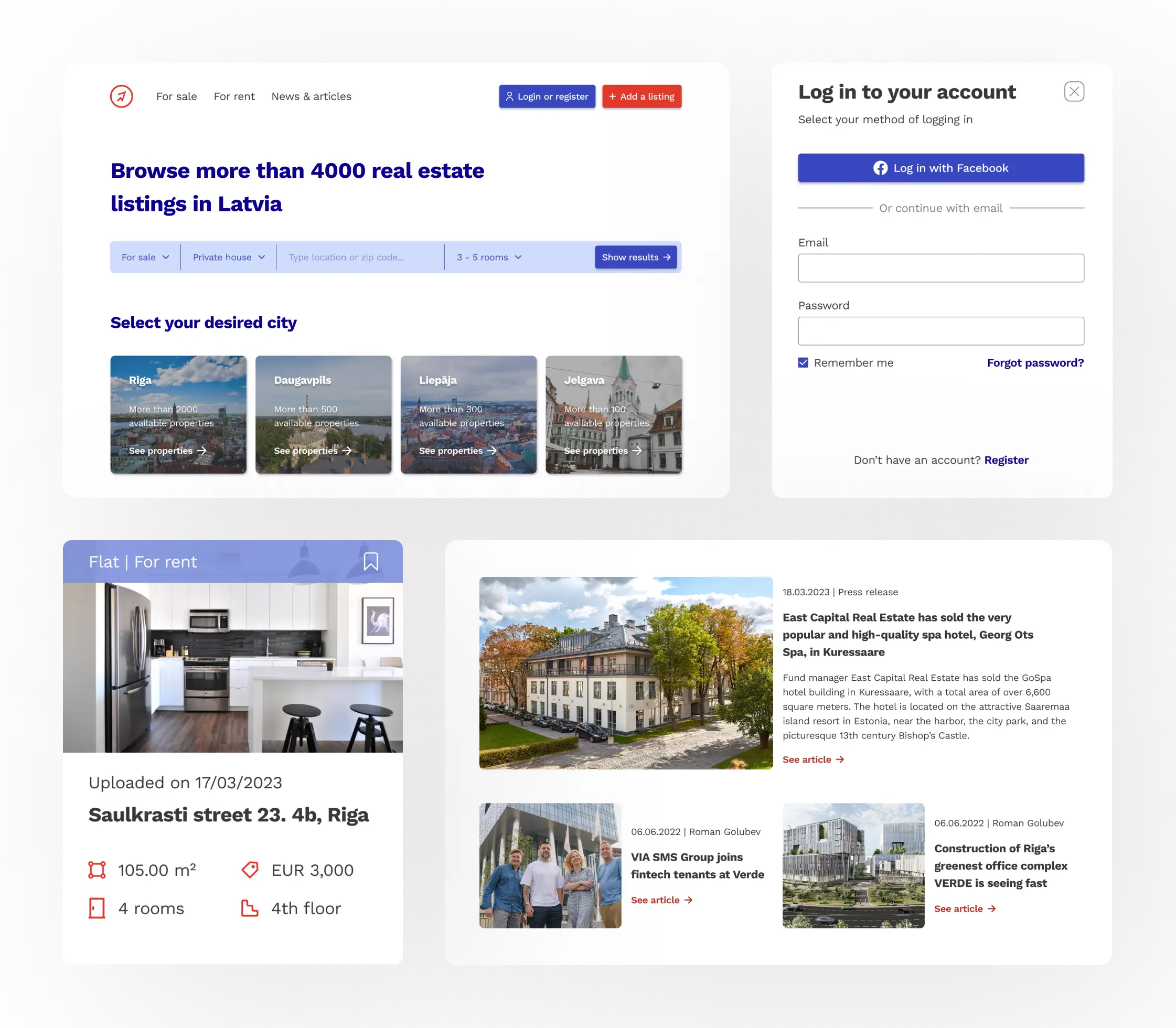
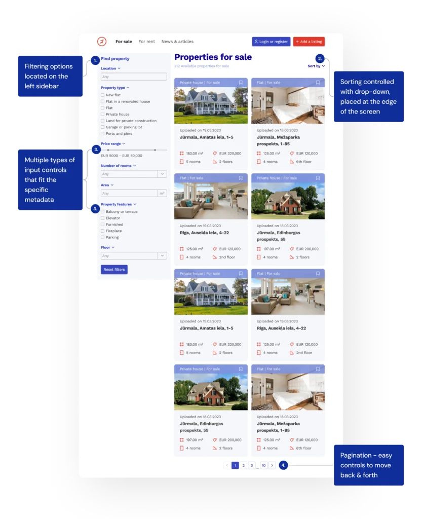
Improving the advanced property search
In the original design, the first thing presented to user on the front page is the advanced search functionality.
The interface is visually dense, and the presence of three competing CTAs creates cognitive friction, making it hard for users to identify the primary action. The input fields and dropdowns lack consistent styling, contributing to a disjointed user experience.

The improved design delivers a cleaner, more focused search experience. By aligning filters in a single horizontal row, it is easier to scan and interact with the element.
A major improvement is the simplified call-to-action. By featuring a single button with a clear label, the confusion is gone, and its placement at the end of the form reinforces the interaction flow and ensures visibility.
Overall, the redesign addresses the main flaws in the original design like overload, inconsistency, and unclear direction. By streamlining the layout and interaction flow, users can now reach a well-filtered, relevant list of properties much faster—with fewer steps and less guesswork.
Mockups and usability testing
After I was finished with the wireframing and the design of the user flows on the portal, I created high-fidelity mockups which the developers used to build up the product.
For testing the product I chose to conduct a series of usability tests. I asked users to think out loud while solving tasks on the interface. I observed the interaction, and compiled the data I found into a usability report that I shared with stakeholders.
Final thoughts & conclusion
Since this project was the final exam of my multimedia design degree, the product did not get deployed. However, I received the highest grade (12) in the Danish 7 point grading scale for my contributions in the project.
Working on this project has taught me to see value in the extensive research and empathize phase in the Design Thinking process. In this scenario, it was crucial for me to find out users’ preferences and needs regarding metadata, because of the advanced filtering and sorting functionalities of the product.
The product was developed using WordPress as a database for the property listings.
My other projects
Enhancing digital language learning experiences with artificial intelligence
ux / ui / product design / AI
A UX case study on integrating AI-driven practice methods into the learning experience at Swap Language, helping internationals build speaking confidence in Danish.
Transforming product discovery for a boutique wine brand
ux / ui / responsive webdesign
I helped customers understand and trust a unique wine accessory by redesigning DropStop®’s website with a clearer structure and modern visuals.