ux / ui / responsive webdesign / branding
Transforming product discovery for a boutique wine brand
Transforming product discovery for a boutique wine brand
I helped customers understand and trust a unique wine accessory by redesigning DropStop®’s website with a clearer structure and modern visuals.
Project overview
I independently redesigned the DropStop® website over two months to create a more modern, engaging, and user-friendly experience.
My contributions
I handled the visual redesign and technical development to ensure that the interface was fully responsive across all devices.
Contents
Outdated design, timeless product
When I first visited the DropStop® Hungary website, it felt like stepping into a time capsule. Originally designed over a decade ago, the site reflected an era when the focus was on functionality and visual design was often an afterthought.
Although DropStop® is a clever and award-winning product, many visitors didn’t immediately grasp its value or how it worked. The existing site lacked storytelling, context, and a smooth product discovery experience — resulting in missed opportunities and unclear messaging.
Site structure
One of the core challenges of the original site was its lack of structure — all products were presented in a single, cluttered view, making it hard for users to understand what DropStop® actually offers.
To solve this, I introduced a new category layer, dividing the product catalog into three clear sections: base products, printed products, and wrapping materials.
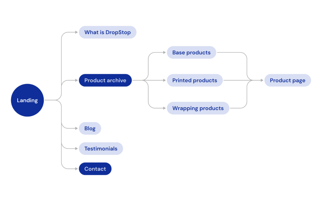
This not only made navigation easier but also gave potential clients a much better overview of what types of solutions DropStop® provides — from off-the-shelf wine accessories to fully branded corporate gifts.
Early explorations and sketches
Low-fidelity sketches helped me quickly test layout ideas and content hierarchy. A key insight was the importance of showing the product in context — how it fits in a bottle, how it prevents dripping, and how it adds elegance to pouring.
On the landing page, I applied progressive disclosure to present key information up front — like what DropStop® is and how it works — while revealing more details as users scroll.

High-fidelity design
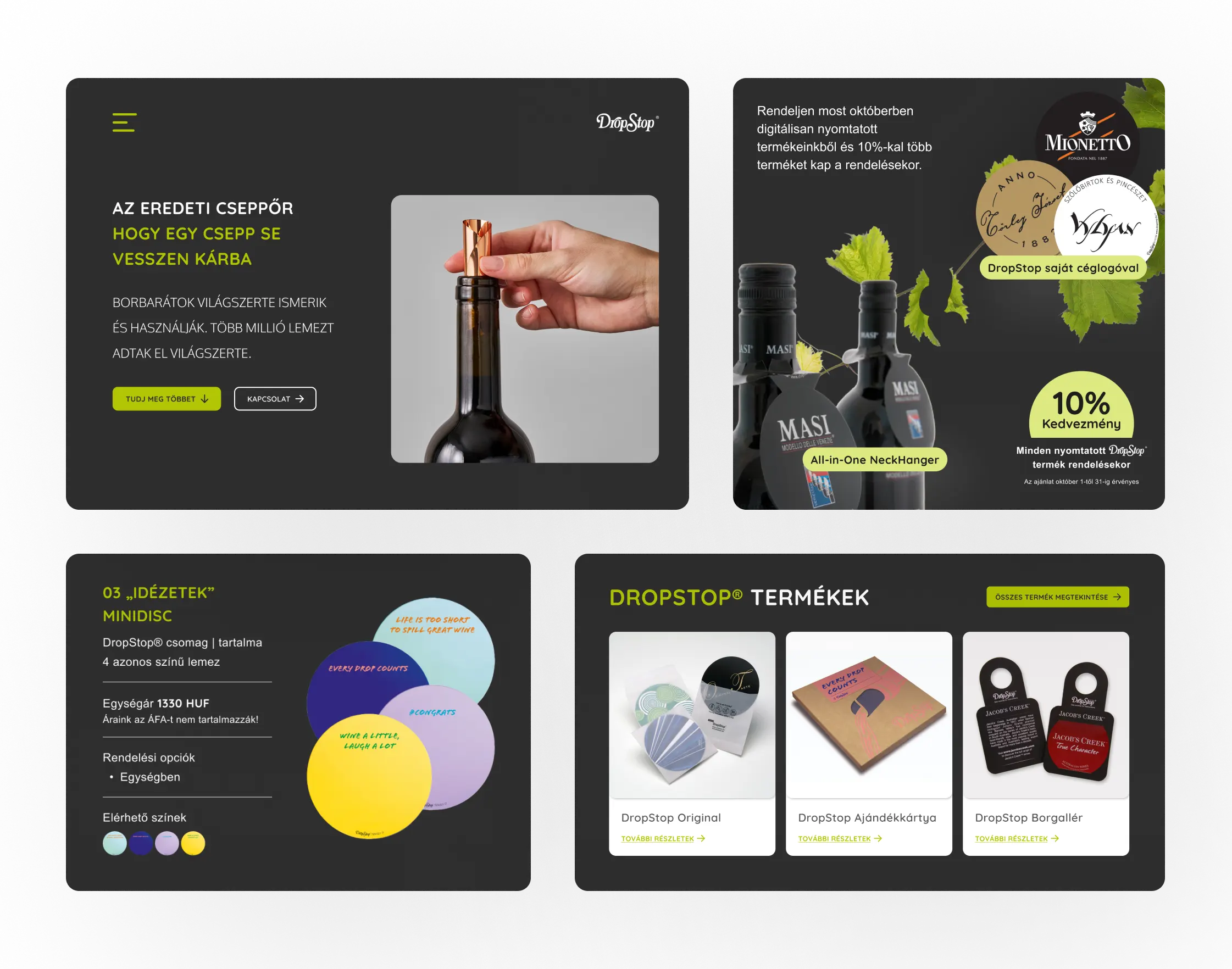
The UI design focused on expressing DropStop®’s unique character: practical and elegant. I used a dark base, bold visuals and clean layouts to create a modern feel.
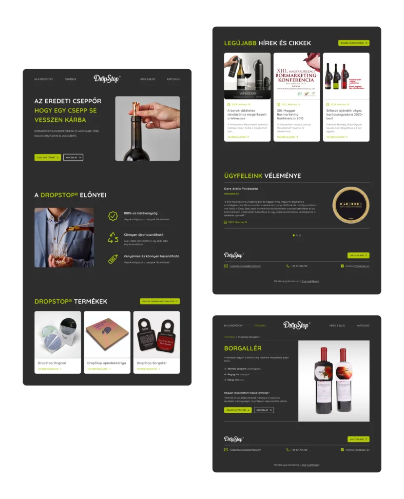
The redesigned landing page opens with an engaging hero section featuring a product demonstration to immediately capture interest.
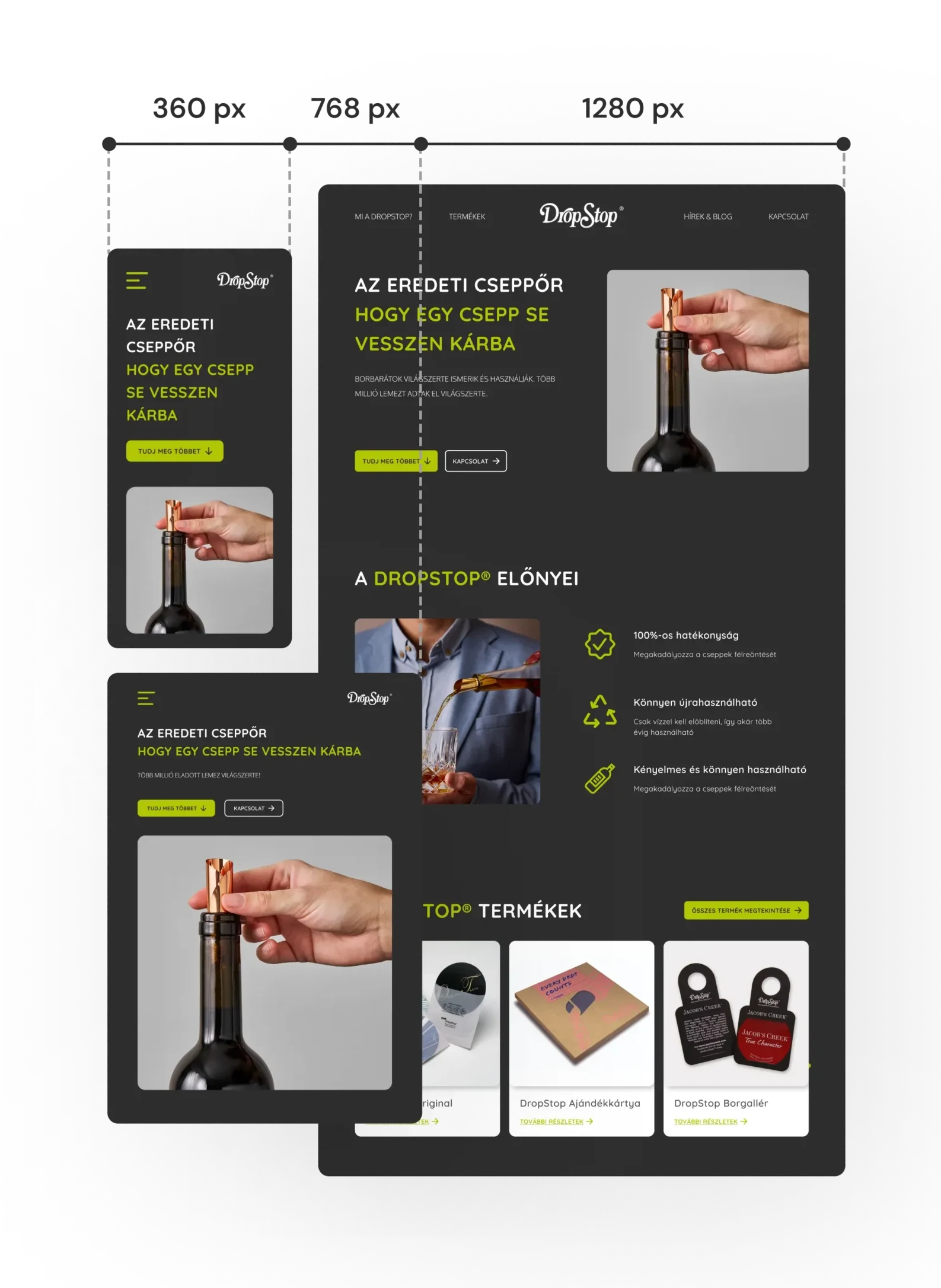
A smooth experience across every device
To ensure a smooth experience across all devices, I designed and built the site using WordPress and Elementor, which gave me the flexibility to create a fully responsive interface that stay clean and engaging at every breakpoint.
I paid particular attention to mobile usability — including button sizing, text readability, and image scaling — so users could explore the site just as comfortably on smaller screens.
Brand and marketing support
To strengthen DropStop® Hungary’s presence across channels, I created a downloadable digital product magazine and price list, giving potential clients a clear overview of the product range and customization options.
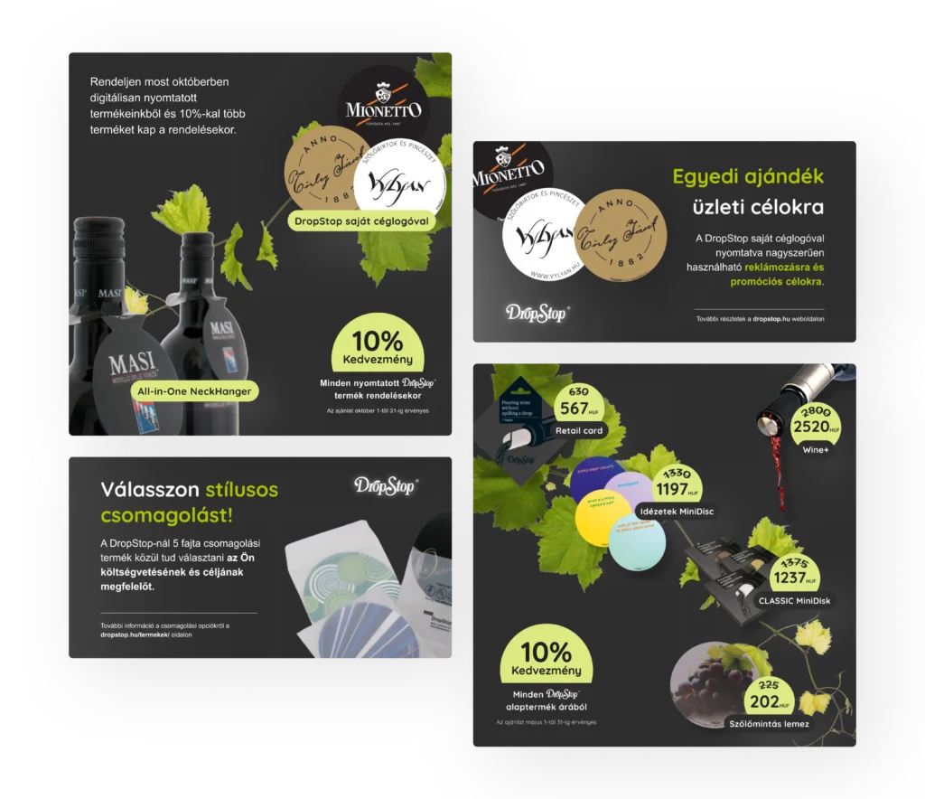
I also designed a series of social media assets, including Facebook banners and post visuals, to help the brand maintain a consistent and professional look across platforms. These materials support both lead generation and brand awareness beyond the website itself.
Measuring the impact
While I didn’t have access to detailed analytics from before the redesign, available year-over-year data shows a strong upward trend.
The chart below shows the total number of users visiting the site, which has grown steadily since the new website launched — resulting in a 90% increase in total users over the past year.

These improvements suggest that the updated structure, visual clarity, and responsive design have made it significantly easier for customers to explore the product and engage with the brand.
Final thoughts & conclusion
This project shows how design can make even a simple product feel exciting and essential — by telling the right story, visually and functionally. With an improved user flow, refined aesthetics, and stronger brand presence, the new experience helps customers not only understand what DropStop® is — but feel why it matters.
My other projects
Enhancing digital language learning experiences with artificial intelligence
ux / ui / product design / AI
A UX case study on integrating AI-driven practice methods into the learning experience at Swap Language, helping internationals build speaking confidence in Danish.
Elevating the experience of browsing real estate properties
ux / ui / design thinking
I helped users confidently search for homes by improving the real estate portal’s structure, usability, and content clarity.