ux / ui / product design / AI
Enhancing digital language learning experiences with artificial intelligence
Enhancing digital language learning experiences with artificial intelligence
A UX case study on integrating AI-driven practice methods into the learning experience at Swap Language, helping internationals build speaking confidence in Danish.
Project overview
The design of the project was carried out over the span of one month, in a team compromised of myself and two other designers.
My contributions
My role in the project was to assist the team though the whole design process, including research, product strategy, user journey mapping, wireframing and final mockups.
Contents
Introduction & problem framing
AI has rapidly become a core technology in education, and Swap Language saw an opportunity to enhance the learning journey through its capabilities.
The Denmark-based company’s main focus is to provide a smoother journey for internationals who learn Danish. This is an extremely difficult language to master, mainly due to the complicated pronunciation rules, thus we decided to outline our research process with the following question:
How might we use the power of AI to ease Danish (and other language) learners’ path to master pronunciation?
Why Danish pronunciation is so hard
In our research, we first focused on understanding what exactly makes Danish learning and pronunciation so notoriously difficult. Our main findings were the following:
- Danish has many silent letters and doesn’t always spell things phonetically
- There is often no connection between how a word is spelled and how it’s spoken
- Native speakers often “swallow” syllables or whole endings, making it tough to hear what’s being said
After establishing the key challenges through initial desk research, it was now time to dig deeper and find out how these challenges affect language learners on a personal level.
Empathizing with language learners
After speaking to internationals about their struggles with learning Danish, I compiled their thoughts and feelings on an empathy map.

In summary, internationals in Denmark struggle with the language because when they speak Danish, they are self-conscious about pronouncing words and they feel like they are unable to express themselves confidently, thus they are often discouraged to practice speaking in social settings, especially in front of Danish speakers.
Brainstorming
At this point in the project, we have explored the problem area and identified the main pain points of language learners. It was now time to tackle the challenge of shaping the knowledge that we gathered into a tool that helps with the challenge of pronouncing Danish words.
This approach reduces the vulnerability learners often feel when speaking in front of others, enabling them to practice confidently and without judgment.
Strategy for AI integration
Having settled on the direction of the new product, we were faced with a challenge:
How do we make the new AI feature an organic part of the already established learning journey?
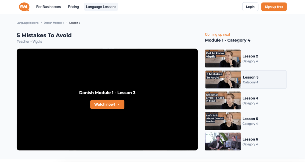
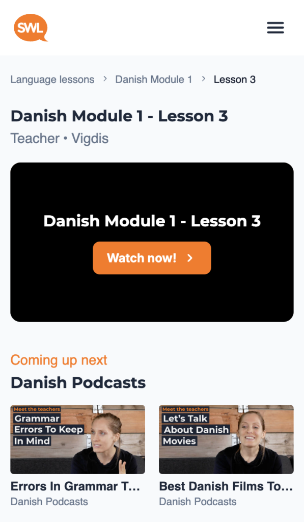
Swap Language’s main product is the language course composed of online video lessons, that are available for users on the company’s learning platform.
By analyzing the behavior of the platform’s returning users, we have learned the following key insights:
93%
of user time is spent on the lesson page, making it the most heavily used part of the platform
2 to 3 lessons
are typically watched back-to-back in a single session, revealing a consistent and focused learning routine
Based on these facts, we decided to introduce the pronunciation practice on this page next to the video lessons, so we can ensure that it’s visible and available to users where they spend the most time actively learning.
We also decided to select the words of the vocabulary assessment practice from the video lessons, so that the practice is viewed as the continuation of the lesson. This would also support the aim of making the new product feel like it’s a cohesive part of the whole learning journey.
Building the pronunciation practice
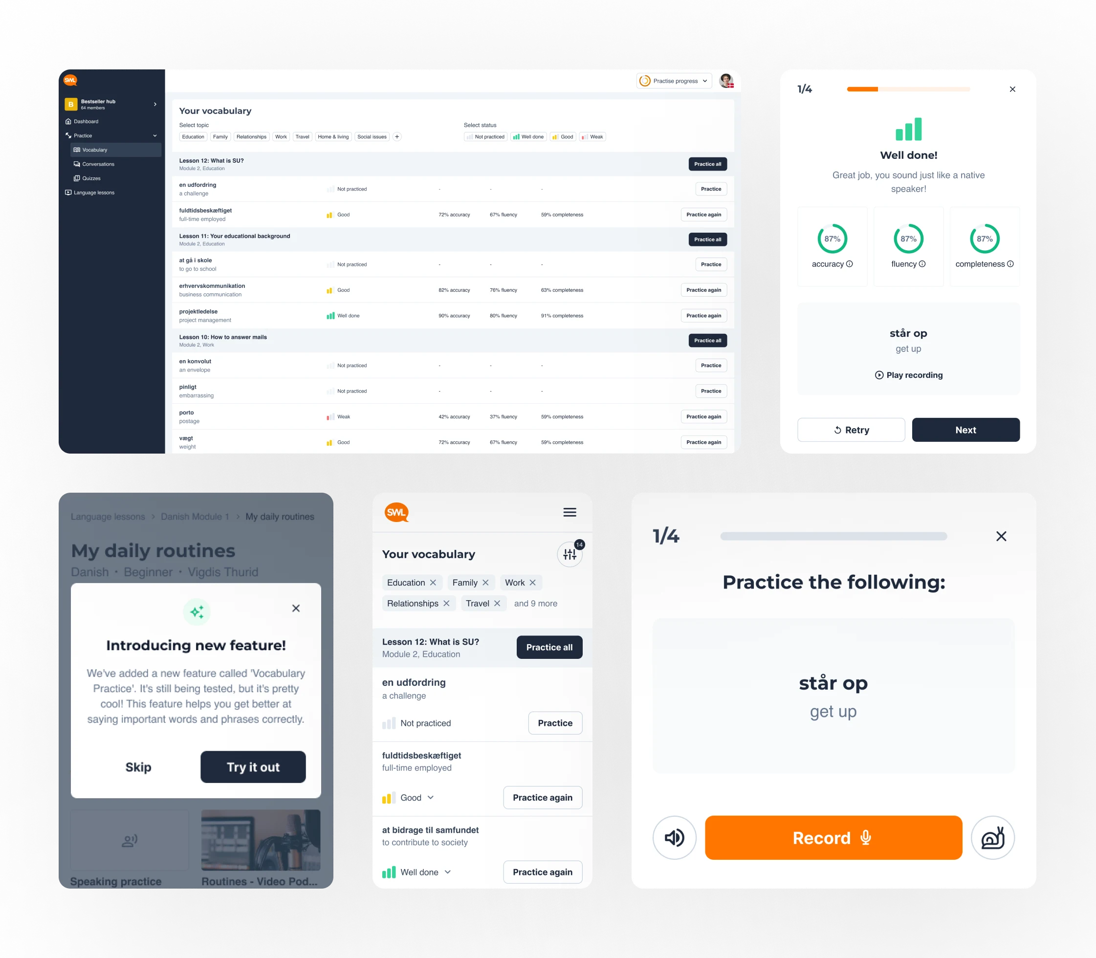
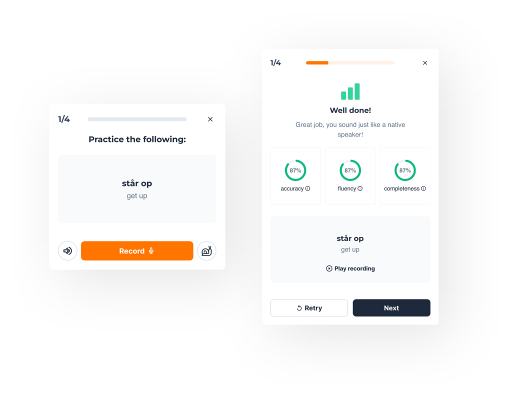
We decided to contain the vocabulary practice in a pop-up modal, so that the user focuses on completing the practice, and experiences no distractions.

When triggered, learners enter the practice flow and are prompted to pronounce a selected word. The AI model then evaluates on three key aspects — accuracy, fluency, and completeness — and provides immediate visual feedback.
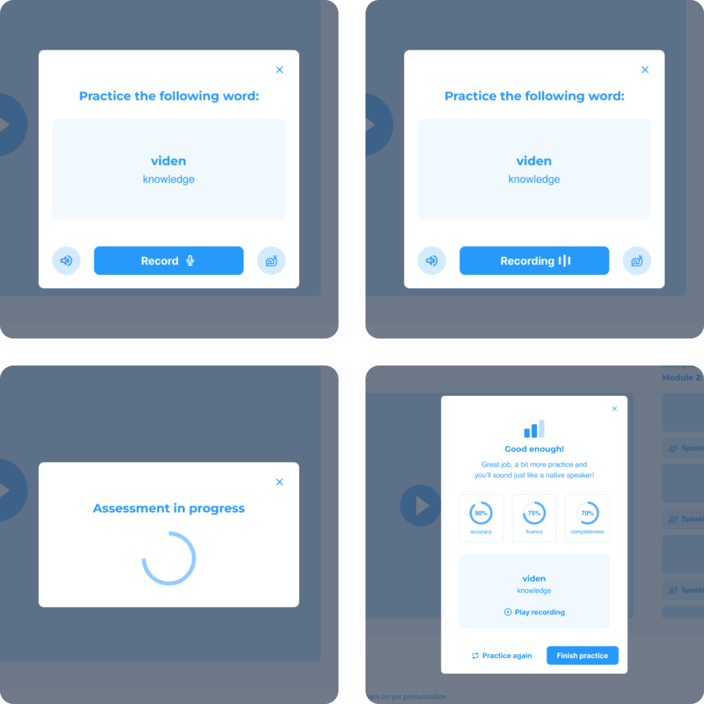
The practice’s tight feedback loop supports quick iteration and builds user confidence without the social pressure of speaking to a real person.
Adapting to different learner needs
During the discovery phase, we have taken note of the fact that there can be several ways that users could utilize a vocabulary practice, based on how advanced they are in learning Danish.
Some users might focus on perfecting their pronunciation and keep repeating the practice of that one word
Others might want to use the practice to expand their vocabulary by learning as many words as possible
To accommodate the user’s varying needs, we decided to implement the practice in two distinct ways on the single lesson page.
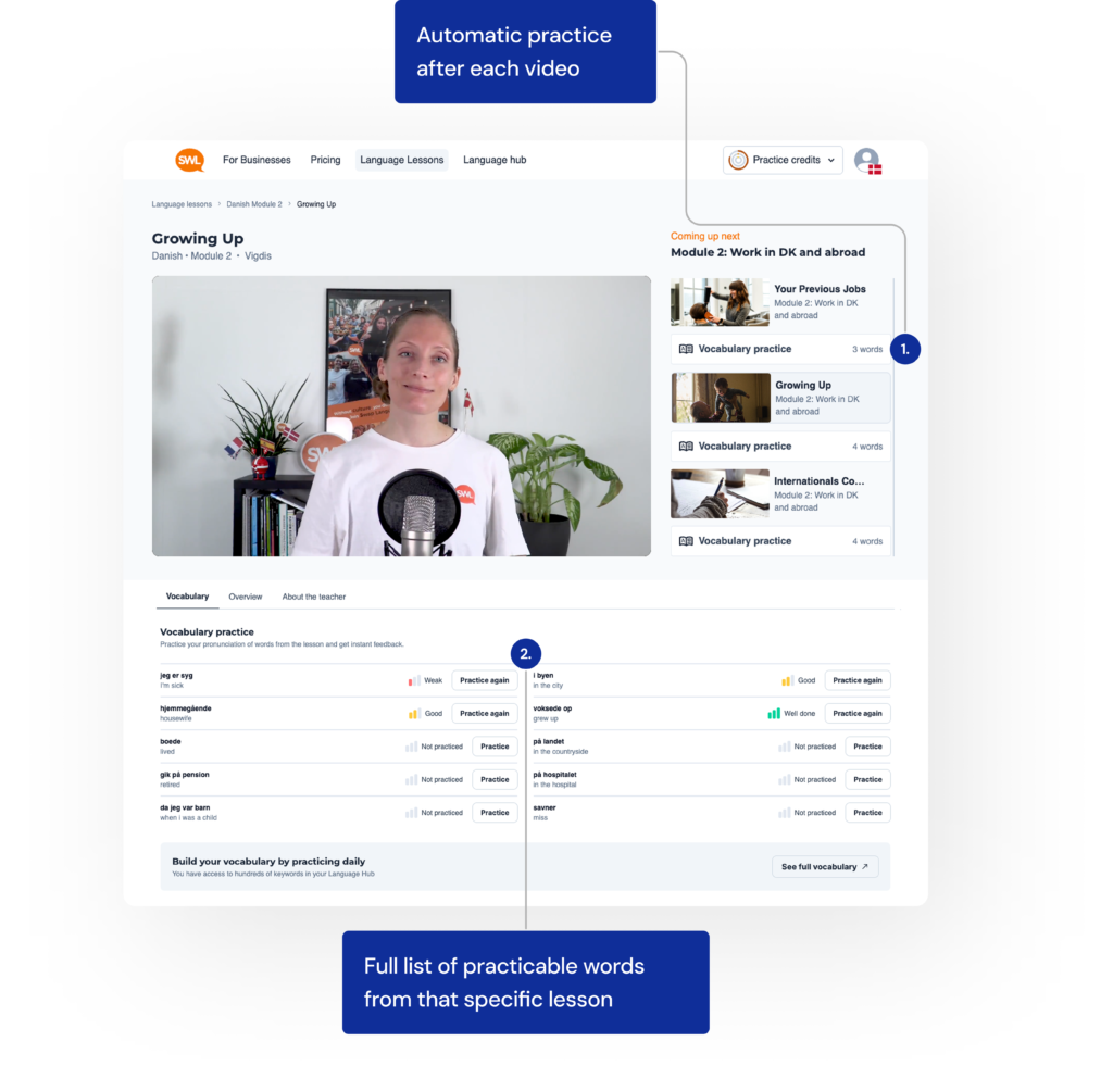
First, we placed a short practice module in the playlist sidebar that is queued automatically after each video. It collects the 3–5 most important words from that lesson, helping users immediately reinforce what they just learned.
Additionally, beneath each video, we added a full list of those words that the user can practice from that lesson. This supports learners who want to go deeper and be more thorough with their review.
Whether the user prefers light-touch repetition or intensive vocabulary drilling, the lesson page now adapts to both styles, allowing full flexibility for users.
Testing two approaches
Besides the touchpoints on the single lesson page, we also introduced a new page in the product called the vocabulary, a collection of all the words from all the lessons that users can practice using the AI.
In order to figure out an efficient structure for this feature, we needed to better understand how users preferred to engage with a long list of words in a vocabulary. We decided to test two approaches:
Option A:
One unified list of all words (with search/filter features)
Option B:
Words belonging to the same lesson are grouped together
We gathered feedback from 15 participants, including Swap Language staff and external users, to assess which approach better supports their learning goals.

The test results were the following: the majority preferred organizing words by lesson, citing the value of contextual learning. They felt that grouping vocabulary by lesson helped them recall terms more easily, retain information longer, and understand how words are used in practical scenarios.
Words feel random without lesson context. Knowing where they came from helps recall and makes the practice feel purposeful.
—Participant, Option B
Final vocabulary design and filtering
Based on the feedback from the survey, we decided to implement the lesson-based grouping as the default structure for the vocabulary page.

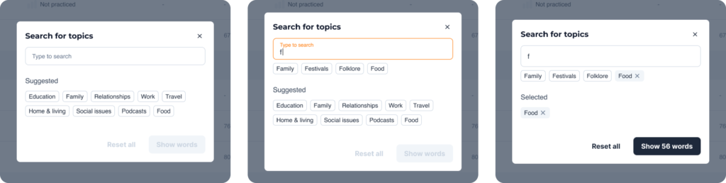
This design choice was intentional: showing all available topics inline would create visual clutter and overwhelm users.
Instead, the modal offers a focused and comfortable experience for browsing, searching, and selecting multiple topics at once — making it easier to tailor practice sessions to the user’s personal learning goals.
The final interface is a user-friendly, adaptable environment that meets learners where they are — whether they want structured review or flexible, targeted practice.
Conclusion & reflection
This project was a deep dive into combining AI and UX to solve a very human problem: the fear and frustration of speaking a difficult language.
Our practice of strategic integration allowed the vocabulary practice to be more than a standalone feature. Embedding it into the lesson structure, made the tool feel like a natural continuation of learning, not an interruption.
Working with this project strengthened my ability to design inclusive tools that reduce the friction and anxiety associated with learning pronunciation and promote self-confidence. It is a successful example of how AI, if used thoughtfully, can enhance, not replace, human-centered learning.
My other projects
Elevating the experience of browsing real estate properties
ux / ui / design thinking
I helped users confidently search for homes by improving the real estate portal’s structure, usability, and content clarity.
Transforming product discovery for a boutique wine brand
ux / ui / responsive webdesign
I helped customers understand and trust a unique wine accessory by redesigning DropStop®’s website with a clearer structure and modern visuals.